

For a cloud kitchen, the identity and food imagery do much of the introduction. Setto needs a clear name among competing choices, a focused menu that is easy to explore, and a visual connection between its different dishes.
HIART / SETTO / A CLOUD KITCHEN IDENTITY
From the first screen.
To the first bite.
Setto is an independent cloud kitchen with a focused menu built around distinctive dishes. Its relationship with the customer starts on a screen and continues when the order arrives. The identity gives that journey a memorable face, a clear name and a recognisable way to present each dish.
Step inside the story ↓CLOUD KITCHEN · FOCUSED MENUEXPLORATION → APPROVAL → APPLICATION

01 / THE CHALLENGE: A DIGITAL FIRST ENCOUNTER
How do you make a restaurant feel familiar
when the first encounter is a screen?
The character gives Setto a face to associate with its name, while food photography keeps the dishes in the lead. Character, colour and pattern form a language that can connect menu imagery, order materials and packaging. This is a design reading of their role in a cloud kitchen experience.
THE EXPERIENCE · A DESIGN READING

Recognise the brand
The face and name introduce Setto as a distinct brand. Clarity matters when the logo has little room.
Let the food lead
A focused menu gives each dish room. Food imagery leads while the logo and pattern connect it to the kitchen.
Keep the connection
Labels and packaging can carry the name, colours and pattern through to arrival. This is a proposed identity extension, not documentation of produced packaging.
02 / THREE EXPRESSIONS OF PRESENCE
One idea.
A different face changes the voice.
The work explored different drawings before arriving at the approved character. Compare expression, proportions and linework: the difference goes beyond headwrap colour.

01 / 03
Proposal one · quiet detail
A more detailed face, grey headwrap and a quiet expression. This route starts with the character’s presence, placing the name beneath it in a unified lockup.
This drawing is an exploration stage, not a component of the approved logo.

02 / 03
Proposal two · compact and playful
A round face, glasses and less elongated forms. This proposal explores a more caricatured voice, with a compact presence around the name.
This drawing is an exploration stage, not a component of the approved logo.
03 / 03
Approved · a more defined expression
The woman and glasses remain, with a red headwrap, dark contour and more defined light and shadow. This is the approved version, also used in the dish presentation materials.
Approval is confirmed by the designer. The analysis explains the visual treatment without inventing the client’s stated reasons.
03 / INSIDE THE APPROVED DRAWING
Details need a role.
Not just a place.
Choose a detail to follow within the character. The artwork stays intact while the focus of the reading changes.
SETTO / CHARACTER STUDYThe headwrap
The raised knot breaks the round outline and gives the drawing a memorable silhouette. Red places an initial focal point above the face.
04 / THE CHARACTER MEETS ITS NAME
ستو in Arabic.
setto in Latin.
One presence.
The Arabic lettering keeps its breadth and curves; the Latin name brings substantial weight and open counters. Colour and the relationship to the character connect the scripts without forcing identical letterforms.


The face can register before every letter is read. It does not replace the name: the complete lockup joins visual recognition to naming.
The dark-ground treatment does not mechanically invert colours; it redistributes contour and lettering as supplied in the identity files. The monochrome Arabic lockup shows the drawing and name without relying on their colours.
05 / FROM CHARACTER TO RHYTHM
The face introduces the brand.
The pattern connects the details.
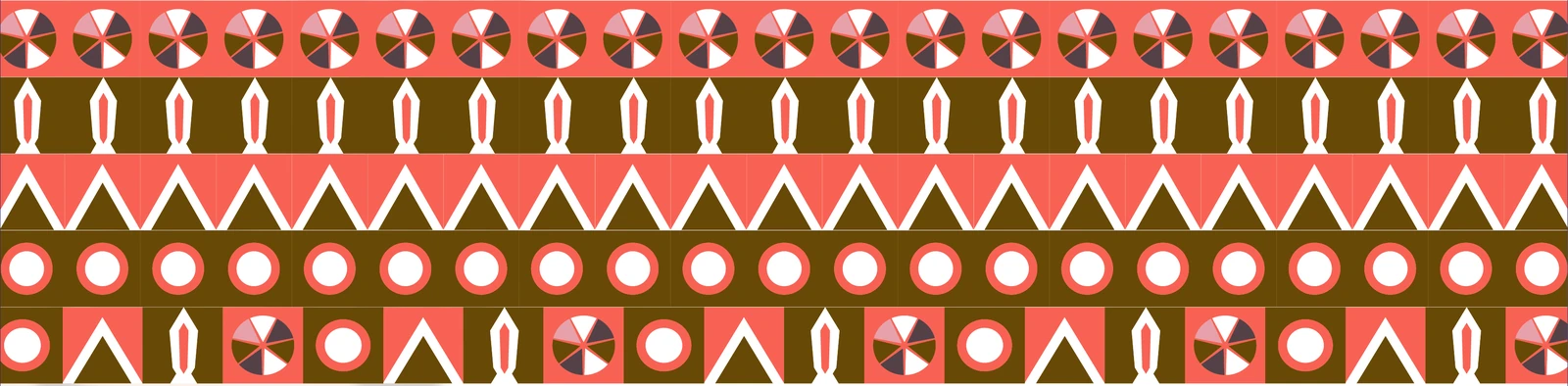
In menu imagery, the pattern can connect dishes without crowding them. On a label or wrapper, it can extend the identity without repeating the full face. Explore units extracted from the original pattern board and move each row to see the repetition.


Segments inside a circle give the row a recurring rhythm.
Spacing and sequence change how a surface is read. The face does not need to occupy every corner: a pattern can carry the identity while giving the logo room to stand out.
06 / A FOCUSED MENU. ROOM FOR EACH DISH.
A focused selection.
Every dish deserves attention.
A focused menu makes the presentation of each dish more important. These original materials show three examples from the project, not the complete menu. Choose a dish, then isolate the food or signature to explore how the design supports the choice on screen.
FOOD FIRST. SIGNATURE CLEAR.
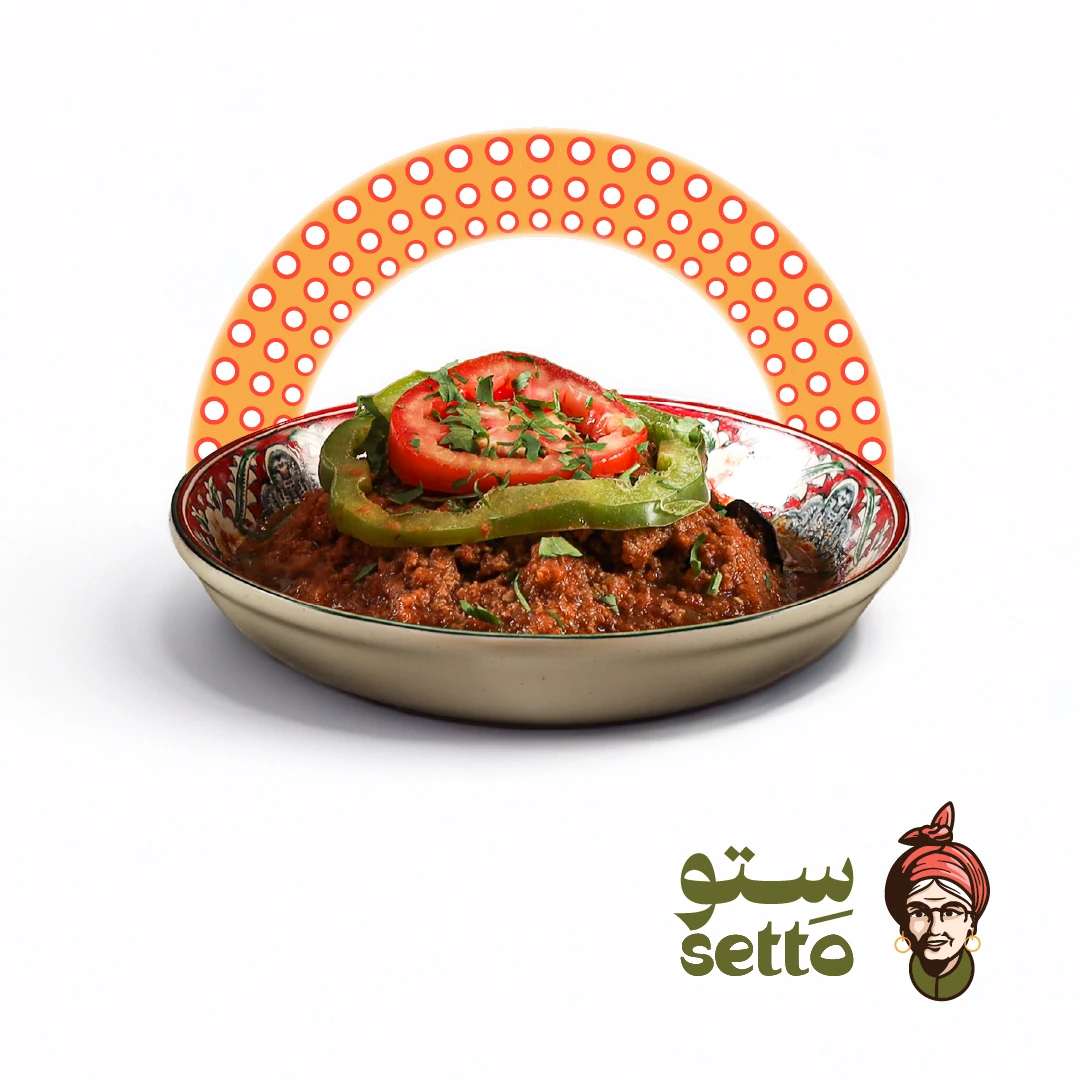
Moussaka
The arc frames the dish without occupying it, with Setto’s signature in the corner. The food leads appetite; the identity leads recognition.
Food, arc and signature each have a role without competing for the same space.
THE OUTCOME
Setto is a cloud kitchen with its own character and a focused menu. A memorable face, a recognisable name and dish-led imagery give it a coherent identity. The design intent is to connect discovery with the order’s arrival while keeping the food at the centre.
The red-headwrap-and-glasses version is approved, as confirmed by the designer. Earlier drawings explain the exploration; functional analysis does not invent the client’s reasons. Pattern and colour excerpts exclude the obsolete drawing in their reference board. Dish images come from the original presentation materials; no sales or operating results are claimed.