
HIART / SELECTED WORK
Areej Alhala
Six logo and identity directions for a nuts brand, from symbol and lettering exploration to the approved concept and packaging applications.
The brief and challenge
Develop a nuts brand that communicates the product and works across packaging and gifts. Six directions were explored and the client approved the second. The client gave no specific reason for the selection; the discussion below is a design interpretation.
Design thinking and decisions
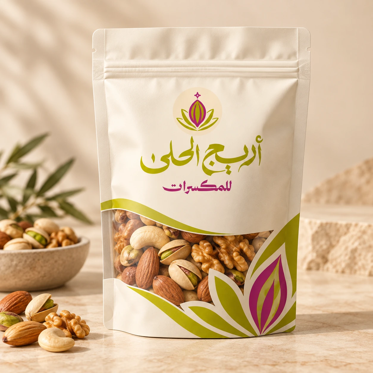
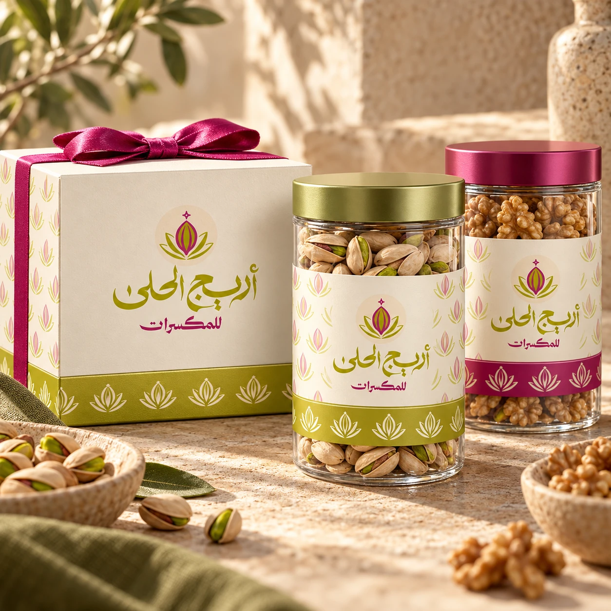
The approved symbol carries product cues alongside the lettering. Green and fuchsia stand out on a cream ground and support a seal and horizontal lockup. Arabic lettering, a horizontal version and a circular seal suit different pack sizes. These are design observations; the actual client selection reason is unknown.
Scope and deliverables
The six source concepts, followed by new conceptual mockups of a nuts pouch, gift box and glass containers. The mockups extend the case study and are not photographs of commercial production.
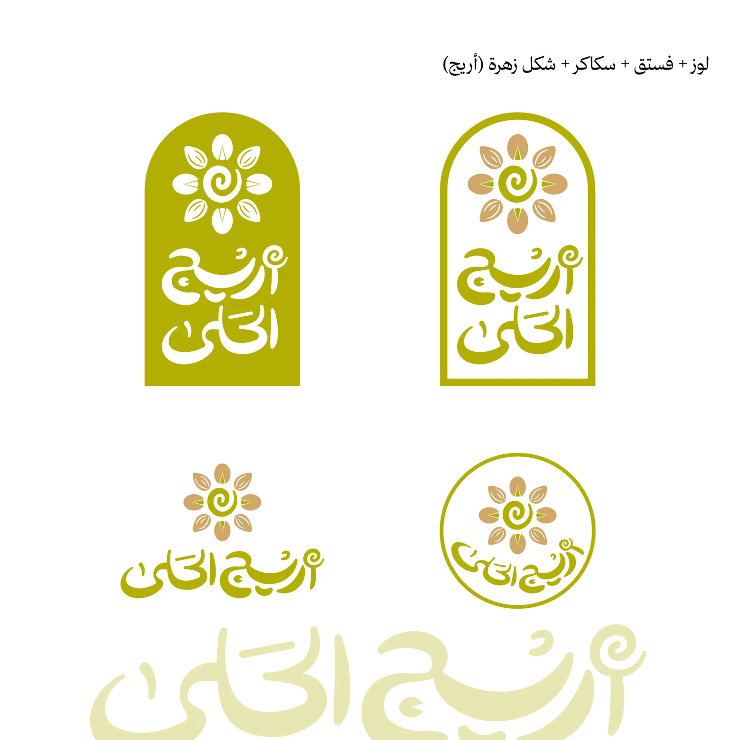
A circular symbol derived from pistachio and sugar, with two coloured borders. It has decorative presence but needs a clearer link between symbol and name.
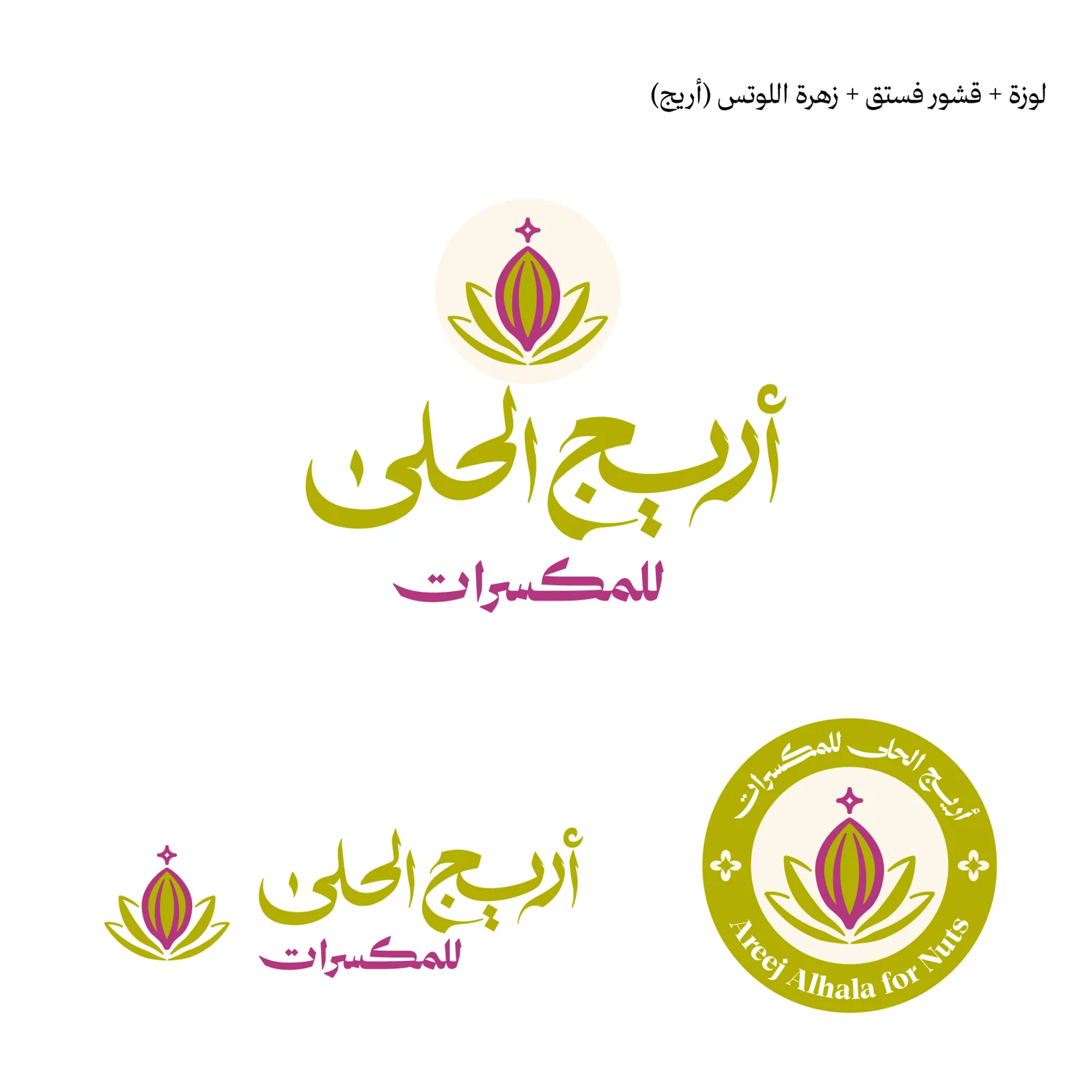
Combines lotus, almond and pistachio cues with Arabic lettering, a horizontal lockup and a circular seal reading Areej Alhala for Nuts. It shows the widest range of visible uses.
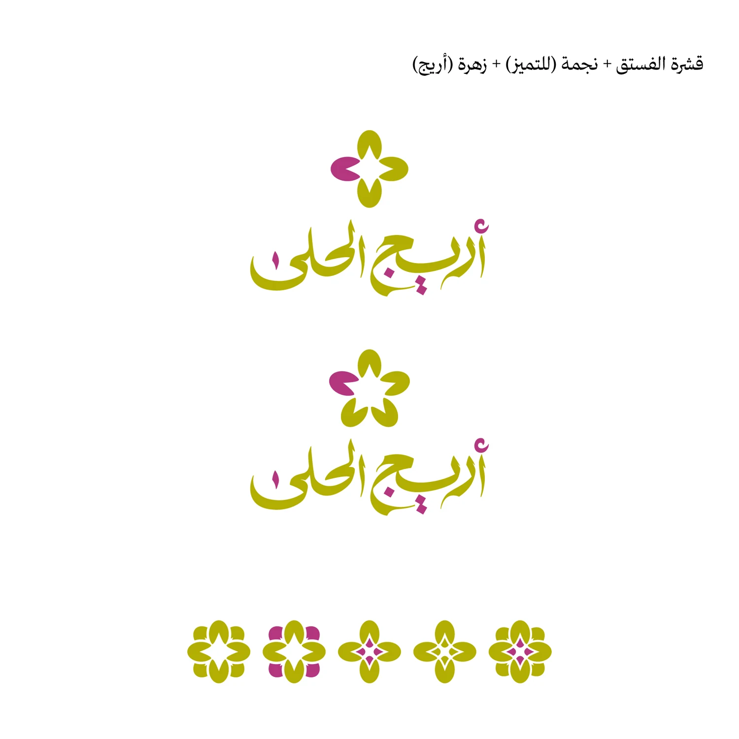
A simplified star or flower above the name, with a decorative pattern. It repeats clearly but relates less directly to nuts than the approved mark.
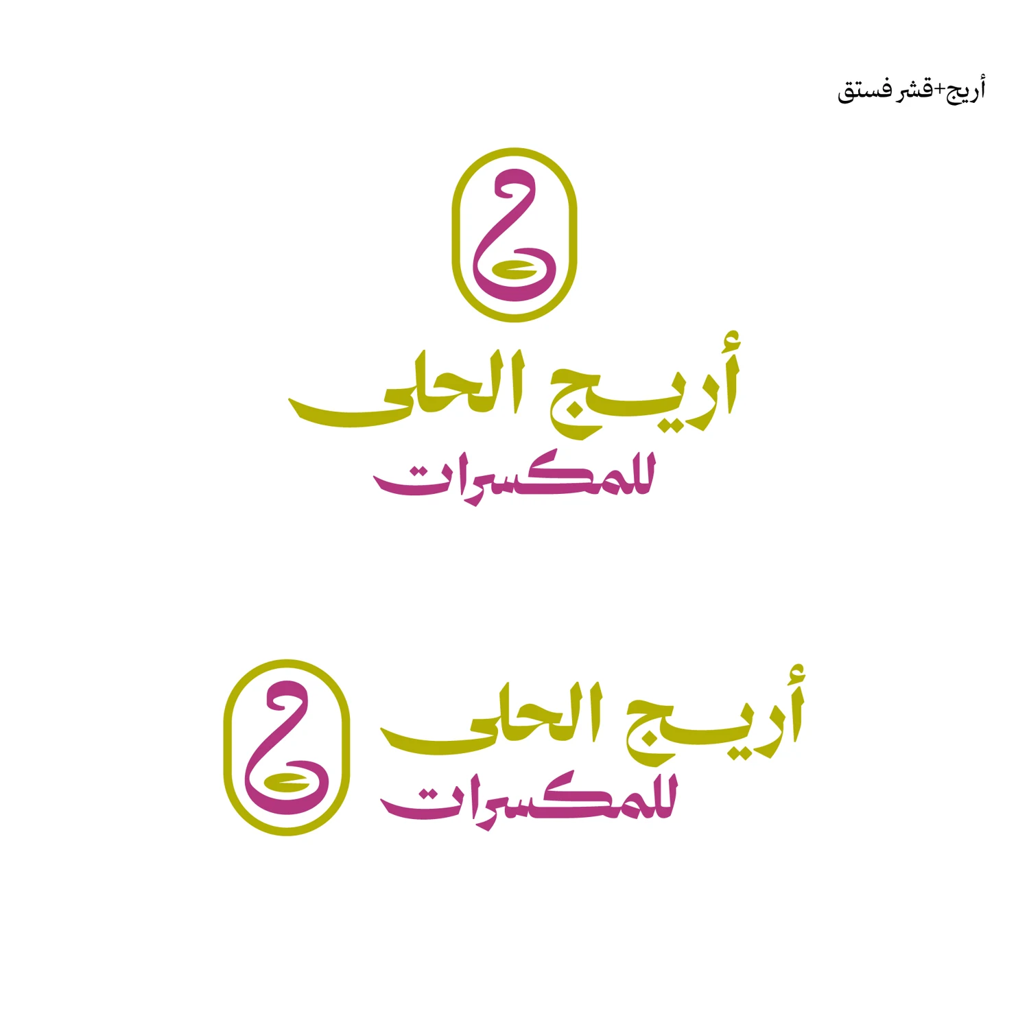
An abstract symbol in a circular frame. Suitable for a compact seal, but the symbol needs explanation or repeated application to become familiar.
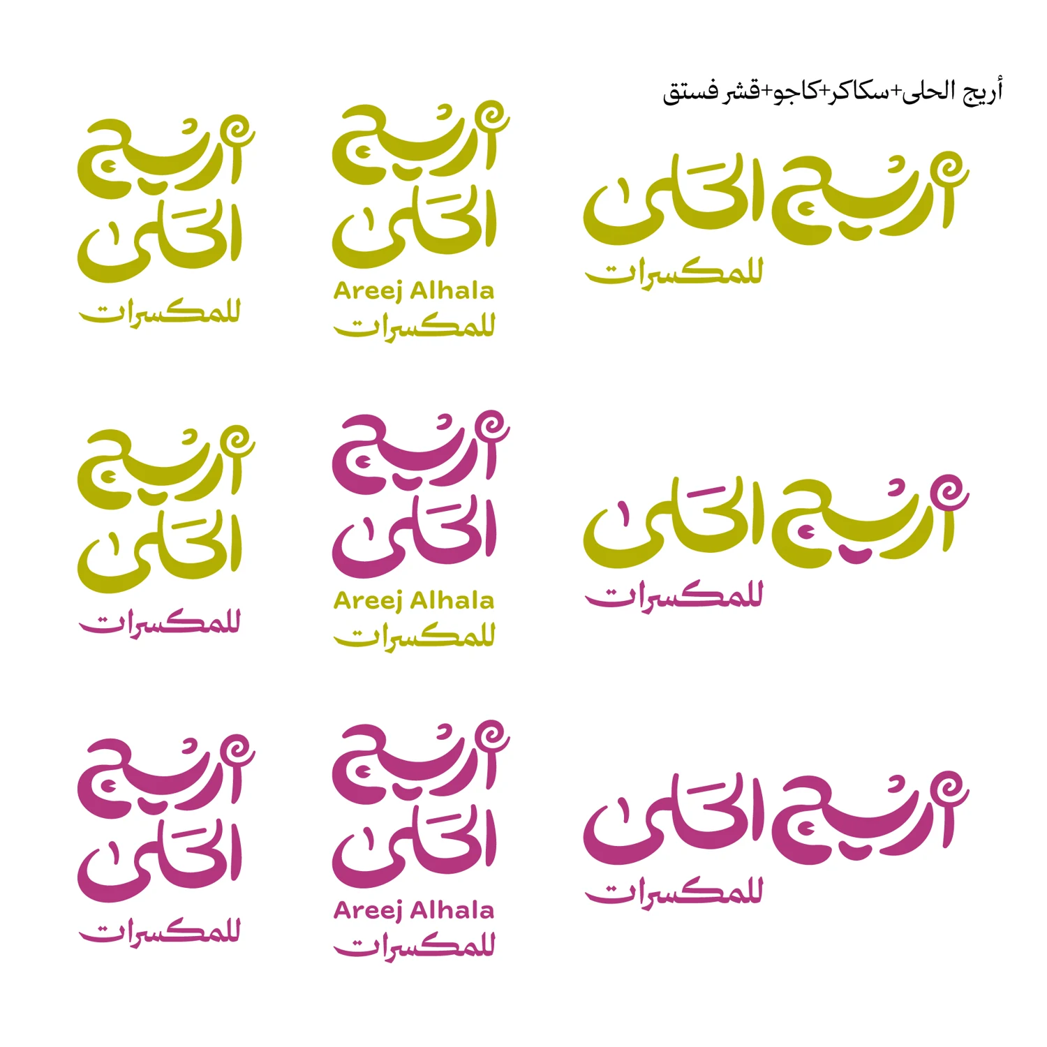
Tests lettering weight and green–fuchsia colour distribution with a Latin version. A useful flexibility study, though it does not alone form a complete symbol and packaging system.
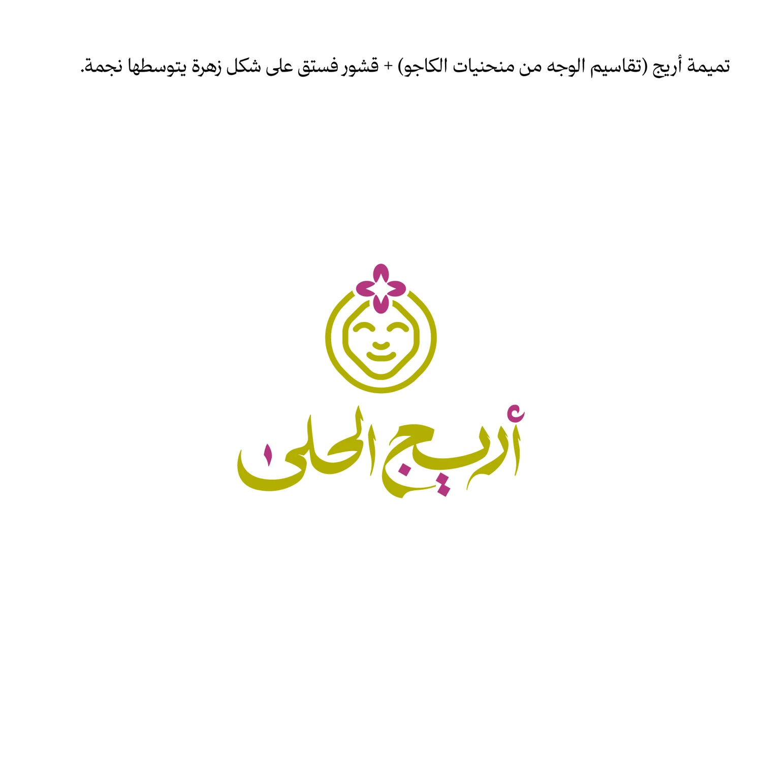
A smiling character or face with a flower. It adds warmth but gives a different tone from premium nuts and gift packaging.