

BRAND DESIGN
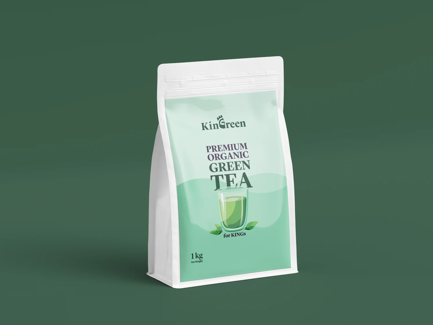
KinGreen
A green identity extending from the logo to a tea pouch.
View case study ↗HIART / SELECTED WORK
Explore the thinking behind our logos, identities, packaging and campaigns. Each case study distinguishes the work delivered and conceptual presentation mockups.
BRAND DESIGN
A green identity extending from the logo to a tea pouch.
View case study ↗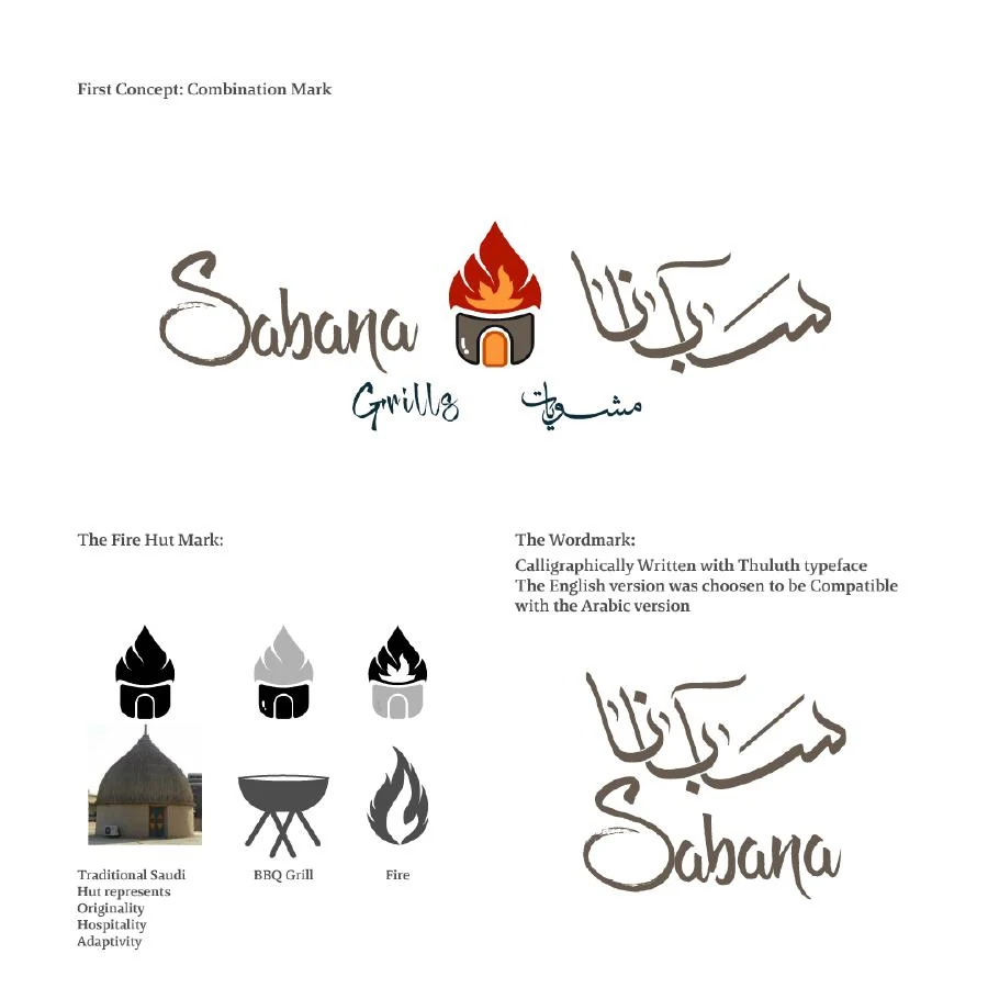
BRAND DESIGN
A logo direction combining the name with flame and grilling imagery.
View case study ↗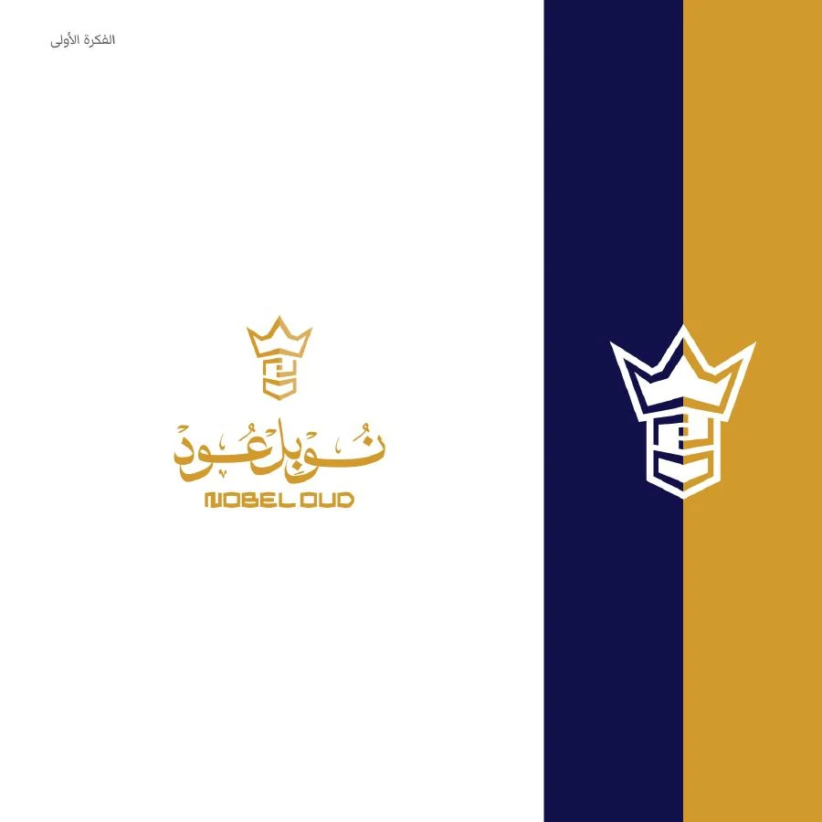
BRAND DESIGN
A blue and gold direction with a crown symbol and gift bag application.
View case study ↗
BRAND DESIGN
A sports mark presented using the available static artwork.
View case study ↗
BRAND DESIGN
Identity development spanning symbols, colour, pattern and lettering.
View case study ↗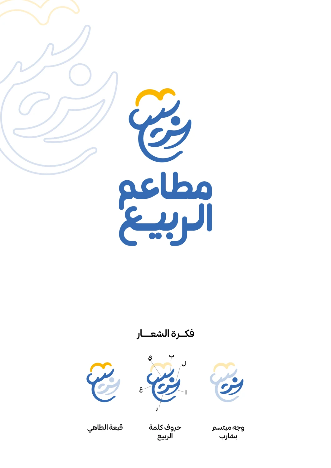
BRAND DESIGN
Arabic lettering, a logo, colour variations and restaurant applications.
View case study ↗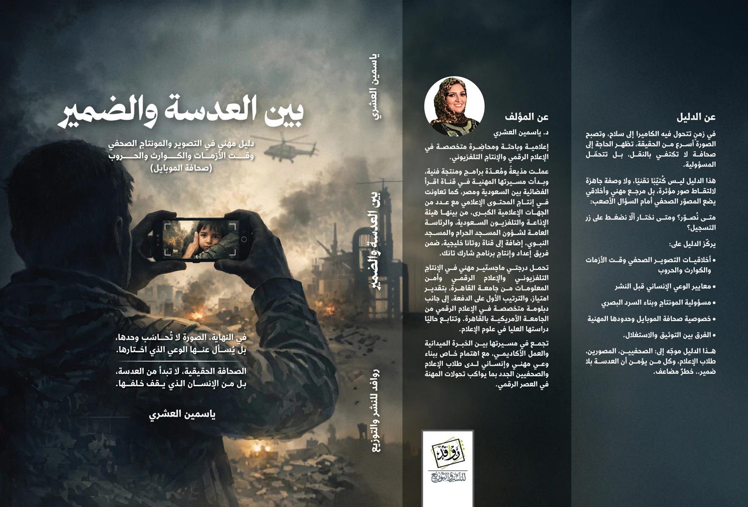
BRAND DESIGN
A full book cover connecting photography, title, spine and back-cover copy.
View case study ↗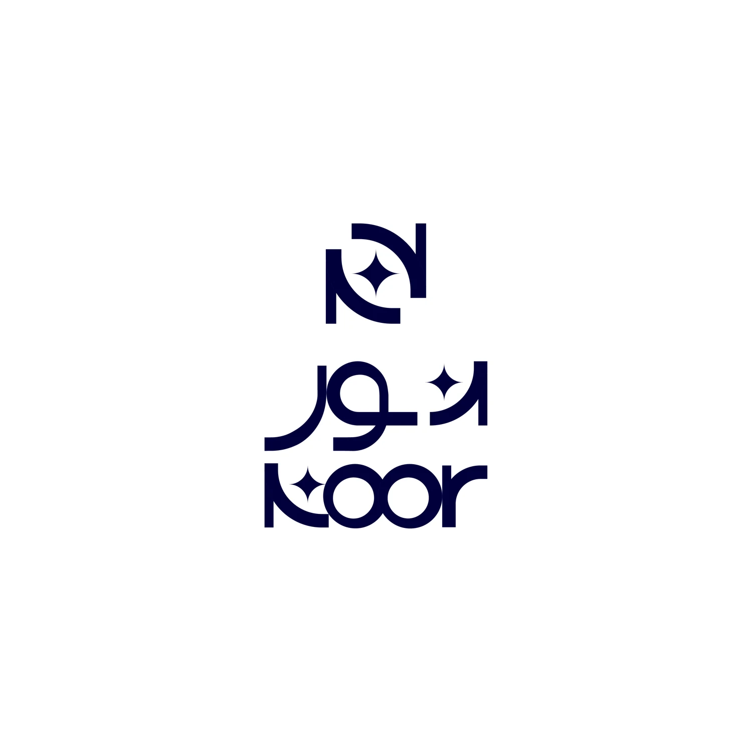
BRAND DESIGN
Arabic and English lettering with a symbol and colour applications.
View case study ↗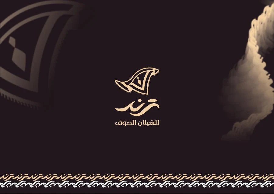
BRAND DESIGN
An identity connecting the Arabic letter ت, the Latin T and the movement of a shawl.
View case study ↗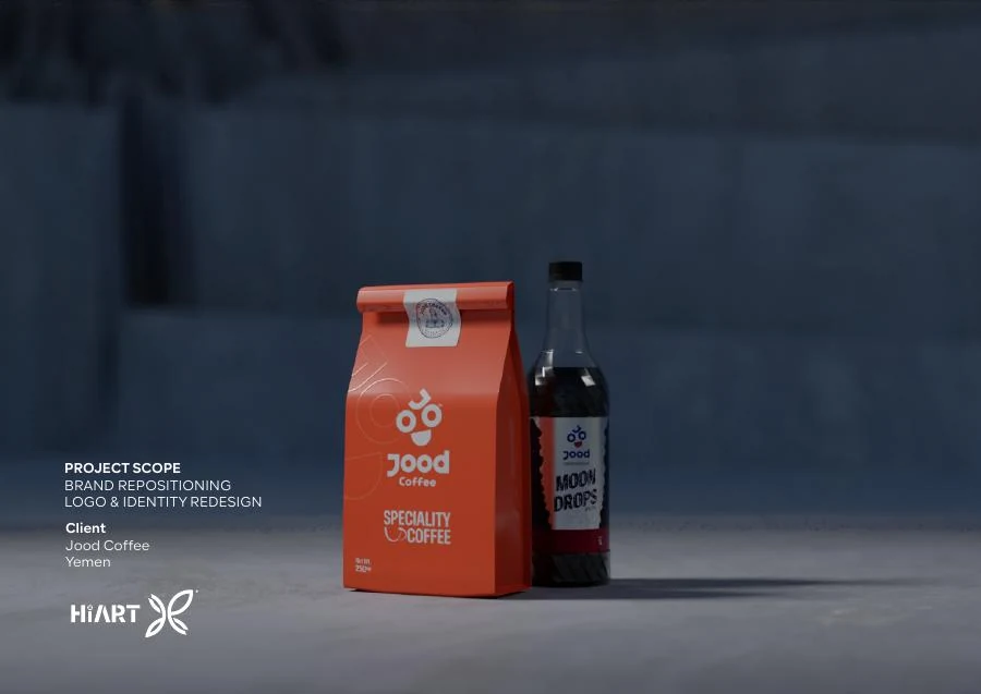
BRAND DESIGN
A coffee identity guide covering concept, pattern, packaging and applications.
View case study ↗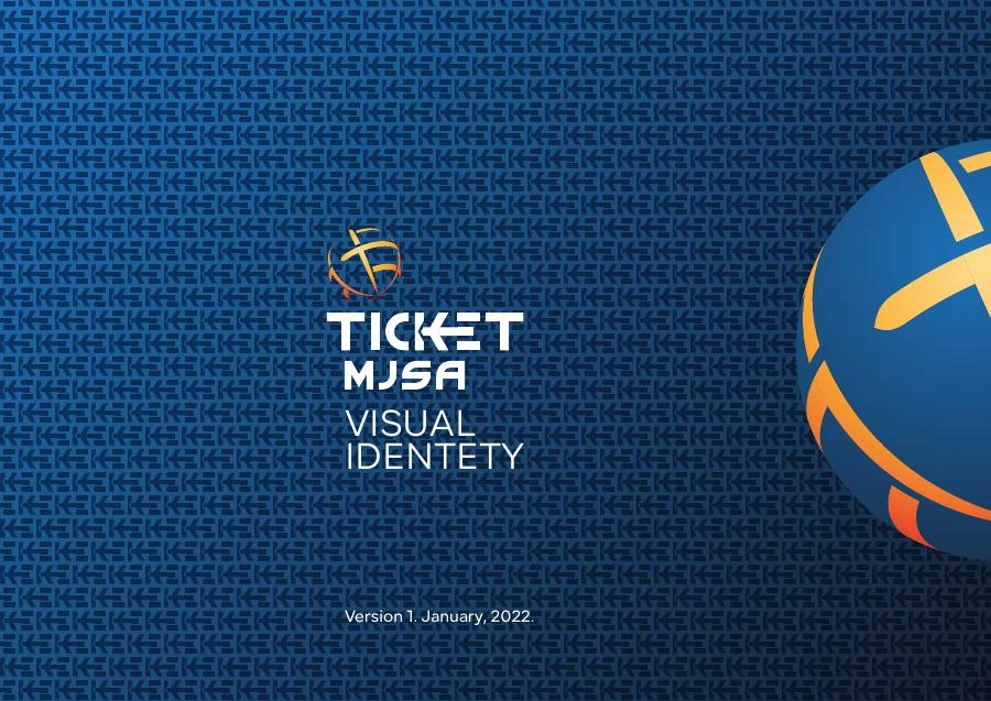
BRAND DESIGN
A brand guide relating a globe symbol to initials and consistent use.
View case study ↗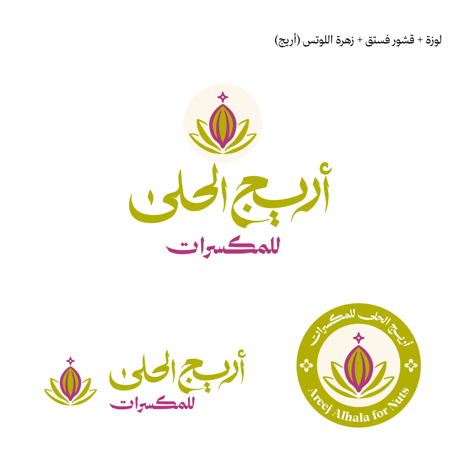
BRAND DESIGN
Six logo and identity directions for a nuts brand, from symbol and lettering exploration to the approved concept and packaging applications.
View case study ↗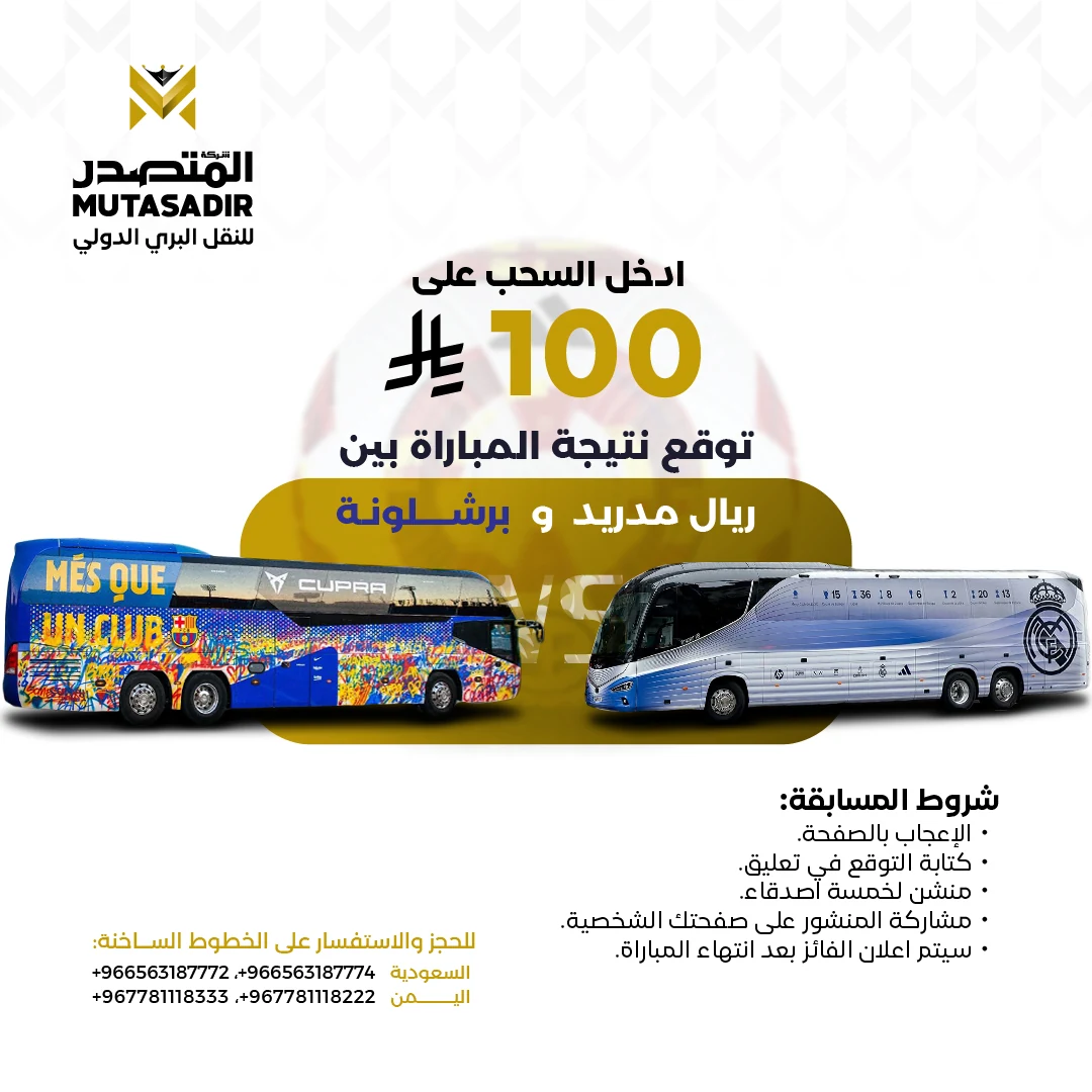
CAMPAIGNS & MOTION
Advertising design, campaigns, animation and motion graphics for a transport company.
View case study ↗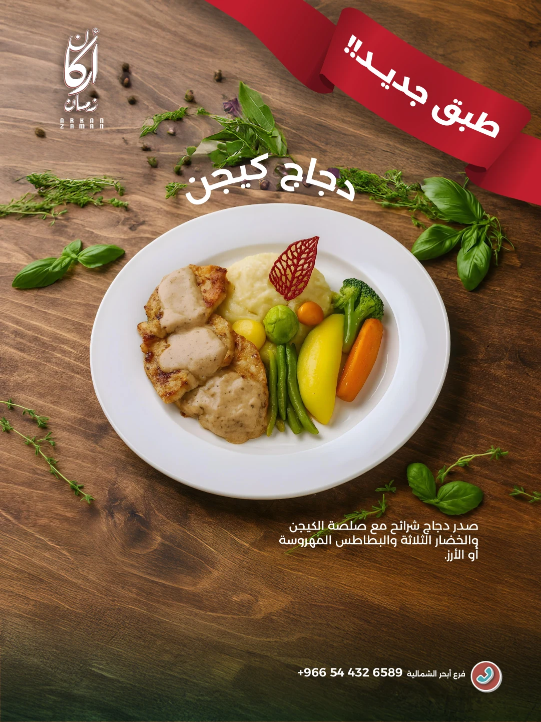
CAMPAIGNS & MOTION
Food advertising combining dish photography, headlines and restaurant branding.
View case study ↗